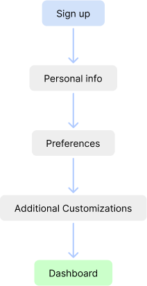
Revamped sign up flow for Hashnode
Introduction
Background
Hashnode is a blogging platform primarily for developers, engineers and thought-leaders. Their goal is to create a tech community on their platform where users can share their blogs about new research, revolutionary ideas, etc. They currently (data from 2022) have over 2 million active users on their platform.
Objective
The objective was to redesign and improve Hashnode’s current Sign up flow to increase foot fall and user engagement by simplifying the process and revamping the UI to make it clean and modern. Since their user base is developers and engineers, having a good UX and clean, modern, and minimalistic UI is a must.
My Process
Understanding Users
Interviews and Surveys
Assumptions
Analyze data and Ideate
Competition analysis
Solutions to pain points
Workflow and key screens
Create Design Solution
Wireframes and key feature workings
User testing and design iterations
High fidelity design
User Research
Interviews
I conducted 10 interviews with Splitwise users to gain insight into their usage, needs and goals.
Surveys
I distributed among 20 Splitwise users to gather quantitative data on user needs and preferences.
Key questions & answers that aided the design solution
What are the different types of sign up flows in industry standard platforms?
There are multiple methods of sign up flows, most notable ones being staggered flow and forced onboarding. In a staggered flow, user is directly taken to the platform in less than 3 clicks and additional process like set personalizations pop up after the user spends some time on the dashboard. Forced onboarding is a process where the user has to fill out every detail to allow the platform to provide fully custom experience for each user. The advantages of staggered onboarding are that it increases the user count since the process to get to the dashboard is very easy. The advantages of forced onboarding are that the platforms aquire enough data from the user to give a custom experience and also it creates the “IKEA” effect where the user is already invested a lot of time and efforts to get to the dashboard, thus feels like using it which the conversion rate.
What is the target audience for the feature update?
The target audience for this feature is developers and engineers in their 20s, since this demographic spends a lot of time online developing their skills and learning new ones.
Currently which platform is the industry leader in this space?
Medium, Reddit and StackOverflow are the industry leaders in the space of blogs, vlogs especially catering to our target demographic of “techies”. YouTube is also a competitor, not in a direct way of being a blogging platform, but it is used my many users to complete their goals.
What are the users goals?
Users goal is to complete the sign up in as little time and effort as possible. Since the user is new to the platform, they just want to explore the functionality before they decide whether they want to invest their efforts to customize (set preferences, follow people, etc) the platform to their liking.
Target audience & Personas
The target audience for this redesign are potential customers of Hashnode. Sign up is the first process that the user goes through on a platform and can boost conversion rates when done the right way. The demographic that Hashnode targets are young engineers and developers in their 20s. Thus based on the target audience and primary user research, I created the following two personas:
Assumptions
Users initially just want to explore and not customize.
Since users are new to the platform and don’t know much about it, I have assumed that they initially want to explore the platform’s functionality and the quality of content on it before investing time and efforts in customizing their dashboard to receive targeted content.
Users are there to read blogs
The first actions performed by new users typically don’t involve writing as they don’t know much about the platform. Additionally, majority of the users are readers and not writers.
Users don’t know the content they wish to see and want to explore
New users are not yet aware of the type and quality of content available on the platform, thus it is assumed that they will initially explore more than search for content or appreciate targeted content.
Types of Onboarding
Forced Onboarding
In this process the user is taken through several steps to gather information and create a personalized dashboard. Typically they ask for preferences, personal details, etc.

Pros
The platforms acquire enough data from the user to give a custom experience and also it creates the “IKEA” effect where the user is already invested a lot of time and efforts to get to the dashboard, thus feels like using it which the conversion rate of the platform.
Cons
A long onboarding process creates frustration in the user’s mind. This might cause them to fill out incorrect information to complete steps or even drop out of the flow completely.
Staggered Onboarding
In this process the user is directly taken to the dashboard in 2 to 3 steps. Additional info required for creating a personalized dashboard and content targeting is asked in intervals while using the platform.
Pros
Minimal initial onboarding steps increase the footfall of the platform and give the users time to experience the platform before personalizing their feed. Additionally, users are more likely to fill out accurate data when asked in small increments over a period of time.
Cons
Initially users recieve generic content which might cause them to lose interest in the platform. Additionally, users might be performing tasks when additional info pops up which might cause the user to skip it and increase frustration.
Ideation
Current Flow
The current flow is in the form of forced onboarding where user has to go through a long series of steps before they are taken to the actual platform. This increases the time and effort which could cause the user to drop out halfway through the sign up process.
Usability Issues
Takes a very long time
Some screens like asking the user whether they are a reader or writer is unnecessary at the time of onboarding as most new users prefer to explore the content and gauge it’s quality before they write a blog.
Error prevention is missing in certain instances
The flow is focused more towards conversion rather than increasing the footfall, and since Hashnode is a new platform, their primary motive has to be to increase user traffic.
There is no option to skip any step
Unclear visual hierarchy in the UI can cause delays and increases error possiblities
Competition Analysis
Understanding the competition and gaining an advantage by carving a niche is a fundamental issue for new platforms to target audiences already used to other alternatives. This guides the product to be a reasonable alternative within an industry which is already populated with giants which in this case are Medium, CSS Tricks, StackOverflow and Reddit.
Key Takeaways
Established platforms generally onboard the user within 3 steps
Most platforms onboard the user in a staggered onboarding flow where the user is taken to the dashboard with minimum efforts and additional data to provide personalized content is asked later while the user is using the dashboard.
Success metrics of the platform on the sign up page builds credibility
Success metrics like total number of blogs published, total user count increases the credibility of the platform in the users eyes.
Users should have the option to skip platform customization steps
Asking for additional data without an option to skip might result in the user giving false information in a hurry to complete the step, thus invalidating the data.
New Task Flow
The new flow is based on the concept of staggered onboarding, where users will be taken to their dashboard 3 simple steps (last step is optional). Additional information for creating a tailored experience would be asked from the user after set intervals of time spent on the platform. This would increase the footfall and would then allow Hashnode to learn more about the users needs by analyzing their behavior on the platform.
Design Solution
Initial Wireframes (Key screens)
Derived Solutions: Old Design vs New Design
Comparing the old design with the new design. The new design was kept consistent with the dark mode theme of the platform dashboard.
Sign up process
The new flow will ask the user for only their email id, username and password. THe step to customize the content thay see from adding tags would be optional. If the users skip this step, they can easily add tags through the dashboard. Additionally, writer onboarding would start when the user clicks on the write button for the first time.
Staggered onboarding
Users can personalize their dashboard content via suggestions and recommendations in both bloggers and tags/topics. Users can fill out additional personal info like tagline through the account settings.
Learning
Learnings
As a UX Designer, I understood the functioning and success metrics for both lead conversion and increasing footfall of a product. It gave me a new approach towards bringing the users to the platform vs improving the patform for the current users, the later being more familier to me.
Future Scope
The current dashboard of Hashnode has some UI/UX irregularities like boxy design, unclear visual heirarchy, inefficient use of space etc. After gather more information about the users behaviour on the platform, I would like to propose a change in the dashboard design itself.

Additionally as a product, Hashnode should incorporate VLOGs as well as create a short-video post feature where users can easily browse content within seconds. It has already been proven by research that people prefer to see short videos as it brings a constant and instant dopamine rush and thus get addicted to platforms like Instagram and TikTok. Hashnode can turn this opportunity and convert a time wasting element to a fun and explorative learning opportunity for users.
Other Projects
Splitwise
Google Calendar
MyFitnessPal